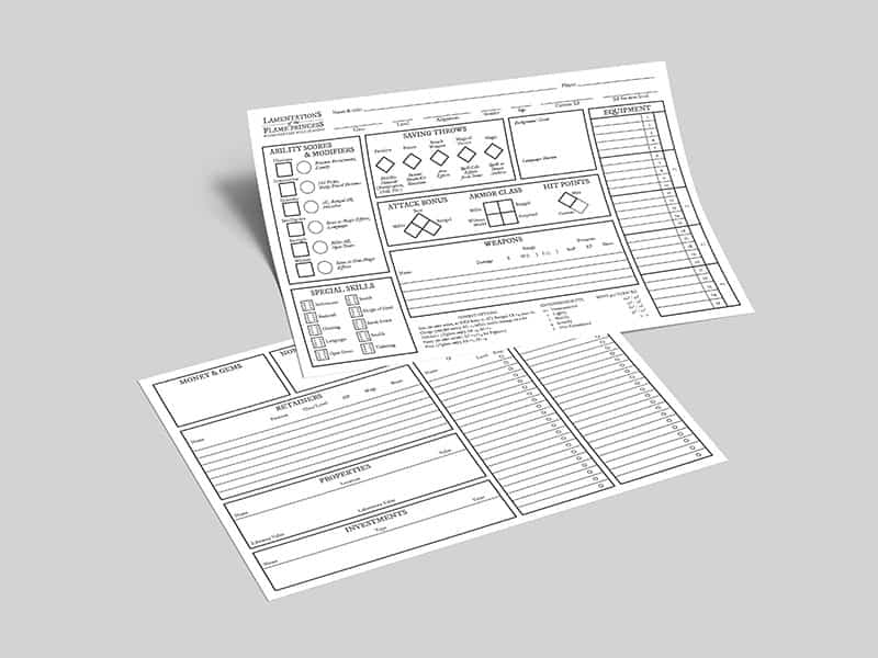
This version of the LotFP sheet was done because I really, really like horizontal character sheets (or maybe I just watch too much television and kinda got used to that format?).
I saw a photo of the layout from what must have been an early take on the current original LotFP character sheet and asked Raggi if he could confirm this, but he didn’t recall ever doing a horizontal version, so I sadly can’t say where the sheet came from, although I’m pretty sure it was used on a gaming convention somewhere to introduce LotFP (due to other material that was visible in the photo). But anyways, I did a new version from that idea and added the back of the sheet.
I like the simplicity and the fact that even though the font spells 1600s, the sheet still works very well with all the weird settings that you face running LotFP products – without spoiling the theme!


Thanks for this, I like it a lot. I am linking folks here again this week on my blog/podcast.
Thank you so much! We appreciate that a lot. We plan to have more regular updates and content in the near future so stay tuned – and I will check out you blog and podcast immediately 🙂